Pages

Wednesday, November 29, 2017

Andrew Sebastian Kwan

Hi World,

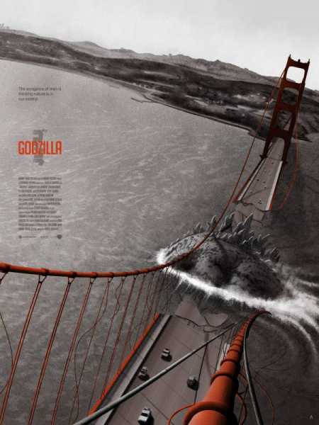
  I didn't post over Thanksgiving, so I am going to give you three posts this week on Monday, Wednesday, and Friday. On Monday, I reviewed the movie Arrival (2016). I am not a fan of the official poster that was released, and I found an alternative poster that served the movie better. As I was researching alternative designs, I came across an artist, Andrew Sebastian Kwan.

  I really enjoy his take on remaking movie posters. He brings an interesting style to the table: polaroid. I have included two of his designs of movies posters that I have already reviewed. Let me know what you think of his designs in the comments!


Until Next Time,
P

Monday, November 27, 2017

Arrival (2016)


"If you could see your whole life from start to finish, would you change things?"

Hi World,

  I am a sucker for a good alien movie, but I was a little set back by the design of this poster. This is my least favorite poster that I have come across in awhile. The floating heads have been quite a trend in the world of movie posters...and that trend needs to end. There is nothing creative about plopping in a few floating heads or bodies without any thought. There are a bunch of little pieces thrown together that do not get viewers excited about the movie.

  I have no clue how the designer of this poster left the biggest part of this movie hidden in the chaos. The ship! It is a unique shape that is unlike the "typical" UFO. Why wasn't this used as the center of attention in a movie...about an alien invasion?

  I found another version of this poster that is much more successful than the official poster that was released. This poster makes me curious. What is that thing? The text "Why are they here?" indicates some kind of alien, and I am excited to see this movie. In my opinion, the text should read "Why wasn't I the official poster?"


Until Next Time,
P


Tuesday, November 21, 2017

Drive (2011)

"My partner is a belligerent asshole with his back up against a wall, and now, so am I."

Hi World,

  I came across this poster while doing a little googling, and I fell in love. I just had to see this movie. If the movie is half as good as the poster design, then it is going to be great. 

  A great movie poster will draw in viewers without any prior knowledge about it. That is exactly what this poster did, and the movie was fantastic to back it up. I could say a million things about what made the movie itself a success, but I'll just leave it at, "you really need to watch it."

  There are a lot of things that make this poster a success: the dimensionality, the text, the color scheme, the focus, the simplicity, and so on. The most successful piece of this design is the creation of 2-demensional planes. I love when artist play with the dimensionality of a typically flat design. There is a great sense of depth that is created by the interaction with Gosling and the text. It draws you deeper into the poster starting with his character, to the text, and through the car into the city.

  Here is the movie trailer if you are interested!


Until Next Time,
P

Thursday, November 16, 2017

Evolution of Great Movie Posters

Hi World,

  I recently read a really great article about the evolution of great movie posters from the 1950's to the 2000's. Each decade has a great recap or summary of the time period and influential styles that shaped the movie posters. Check it out!

1950's Poster
2000's Poster

Until Next Time,
P


Tuesday, November 14, 2017

Thor: Ragnarok (2017)


"So much has happened since I last saw you! I lost my hammer, like yesterday, so that's still fresh. Then I went on a journey of self-discovery. Then I met you."

Hi World,

  The Thor: Ragnarok (2017) poster has the design world swooning. Another blogger quotes that it is a "psychedelic Photoshopped masterpiece," and I agree. So, let's talk a bit about the psychedelic art movement. The movement took place from 1960-1975. The style is described as being influenced by hallucinogenic drugs, often LSD, using intense colors and curvy typography. This movement uses much of the same techniques, especially the typography, as the Art Nouveau movement (1880-1910). They psychedelic movement influenced much of life in the late 60's and 70's. Music, art, and pop culture saw changes. Here are a few examples of psychedelic art.


  I would also like to talk about the successful use of imagery in the poster. The way the characters are positioned and stacked reminds me of nesting dolls. Starting with the huge Hulk, the characters become slightly smaller down the line. It is clear that these shots were taken with purpose for this design. Movie posters often struggle when minimal thought is put into the images used. When a "good enough" images is used in a poster...it is obvious. The same is true when a well thought out image is used. All in all, this is a beautiful design, and I am very excited to see the film.


Until Next Time,
P


Thursday, November 9, 2017

Awesome Alternative Movie Poster Designers

Hi World,

   I found a great blog that highlights some really wonderful poster designers. My blog focuses mainly on the posters that would have been and are being shown in movie theaters, but these designers are creating alternative movie posters...and they are AWESOME!

Here are a few that I fell in love with:


Until Next Time,
P

Tuesday, November 7, 2017

Blade Runner (1982) Continued


"'More human than human' is our motto."

Hi World,

  In October I decided to try something a little different. I gave my initial thoughts about a movie poster for a movie that I had never seen, Blade Runner (1982). I wanted to look at the design to see what I could figure out about the movie before watching. I was really attracted to the color scheme of the design. There were two obvious parts, the warm and the cool tones. I got a "bad guy" vibe from the characters in white, which confused me a bit. White usually symbolizes something that is pure, and definitely not a "bad guy." The costumes,  makeup, and clear separation from the warm tones is what lead me to my initial conclusion. However, after watching the movie, I have a very different understanding and theory about the intentions behind this design choice.

  The characters in cool tones are Roy Batty (a replicant), Pris (a replicant), and JF Sebastian (a genetic designer). In the movie, we learn the most about the replicants, Roy and Pris, and I began to sympathize with them. Replicants are machines, but they have begun developing personalities and having a mind of their own, so humanities answer: a 4 year life-span. These replicants have returned to Earth to find a potential solution to their extremely short life-span, even though replicants are illegal on Earth and will be killed ("retired")  upon discovery. I believe that these two are portrayed in the white/cool tones because they are, in a way "innocent." Though they have committed violent crimes, off planet, but they were done in search of a true life that they are being denied. There is one other character, JF Sebastian, being presented in a white/cool tone. In a way, this character is also an innocent. We know that he is brilliant, but is unable to move off planet due to his health condition. He is alone. He builds his "friends," but he lives alone and interacts with very few people.

  My ideas of the reasoning behind the design changed greatly after I watched the film, but I did pick up on some of the conflict initially. I immediately was conflicted by the contrast of the characters in white. I believe this was done intentionally by the designer to get viewers to think more about the characters, and not get caught up in the first impression.

I really enjoyed this movie, and I'm always looking to learn more about the content. Here is a great article if you want to read more about Blade Runner.

Until Next Time,
P

Wednesday, November 1, 2017

Best Movie Posters of 2017

Hi World,

  I came across a fun article about the 17 best movie posters of 2017. Take a look at what made the cut! My personal favorite from the list is the poster for Logan. It has a similar design style to that of the Indiana Jones movie posters.


  Comment below and let me know what you think of the 17 best movie posters of 2017!

Until Next Time,
P